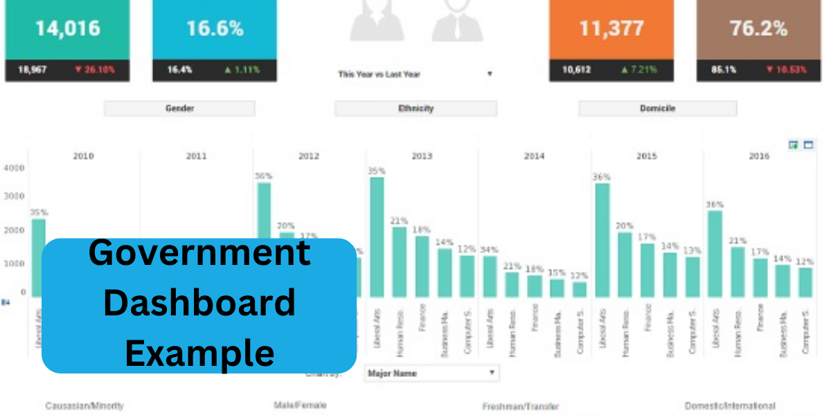
Government Dashboard Example: How Data Visualization is Revolutionizing Public Services?
In recent years, the use of data has become increasingly important in the public sector. Government agencies have started to realize the importance of data visualization and have developed their dashboards to help them manage their services effectively. This article will discuss the benefits of data visualization and explore a government dashboard example.
What is Data Visualization?
Data visualization is representing data in a visual format, such as graphs, charts, and maps. It allows users to understand complex data sets and patterns quickly, making it an essential tool for decision-making. Visualization can help users identify trends, patterns, and outliers in data that may be missed in a traditional tabular format.

Benefits of Data Visualization in Government:
Data visualization has several benefits in government, including:
- Faster Decision Making: Visualizing data can help government officials make decisions faster. With the help of graphs and charts, decision-makers can identify patterns, trends, and outliers more efficiently.
- Improved Communication: Visualization helps government officials communicate complex information to the public in a more accessible and understandable way. It also enables collaboration between different departments and agencies.
- Improved Transparency: By making data more accessible and understandable, visualization can increase transparency in government operations. Citizens can use this information to hold their government accountable and to make informed decisions.
- Improved Efficiency: Visualization can help government officials identify inefficiencies in their operations, allowing them to optimize their resources and services.
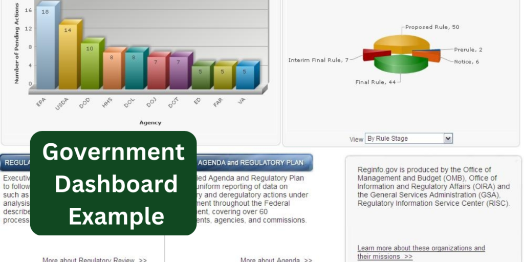
Government Dashboard Example:
One of the most prominent examples of a government dashboard is the United States government’s “IT Dashboard.” The IT Dashboard was launched in 2009 to provide visibility into the government’s IT investments. It allows the public to track government IT projects’ progress and associated costs.
The IT Dashboard provides several visualizations to help users understand the data. The dashboard includes the following:
- Graphs that show the progress of each IT project.
- The cost of each project.
- The overall portfolio of IT projects.
The dashboard also includes a map showing each project’s location and a table showing each project’s status.
The IT Dashboard has successfully increased transparency and accountability in government IT projects. The public can now track the progress of these projects and hold the government accountable for their costs and outcomes.
Conclusion:
Data visualization is revolutionizing public services by providing government officials with a tool to make more informed decisions, communicate more effectively with the public, increase transparency and accountability, and improve efficiency. The IT Dashboard is just one example of how visualization can improve government operations. As data continues to play an increasingly important role in government, we can expect to see more and more government dashboards in the future.
The government plays a crucial role in shaping the progress and stability of a nation. It is responsible for creating laws, policies, and regulations that ensure the well-being of its citizens, promote economic growth, and maintain order. In Dubai, the government has been instrumental in transforming the city into a global hub for business, tourism, and innovation. With visionary leadership and a commitment to progress, the Dubai government has invested in state-of-the-art infrastructure, cutting-edge technology, and sustainable development projects. Whether through the implementation of smart city initiatives or efforts to enhance public services, the government of Dubai continually works to improve the quality of life for its residents and visitors. For more insights into the latest government initiatives and updates in Dubai, visit idealdubai.ae, your trusted source for the latest news and developments in the UAE.